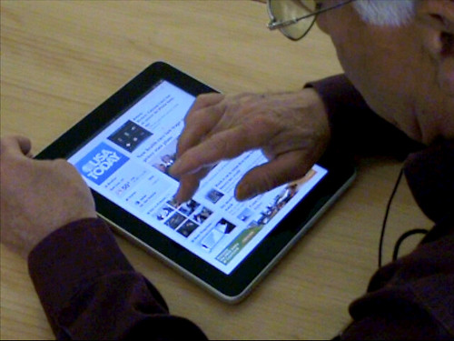
Last Monday a bright brand new iPad came to Biko.
After hanging around with some free apps on the iPad, we’ve appreciate some good (win!) and not so good (fail!) practices on user experience solutions on those apps. That’s essential work before designing our new apps!
iPad user experience first ideas
While the Internet is the hypertext world, infinite, endless, the iPad is a closed box, where apps have a start and an end. The user needs to get this feeling of closure, and we need to build that appearance with the application’s information architecture and user interface structure.
iPad is a new gadget, however, users will make some assumptions, because they’re iPhone users, because they’ve used before a tablet… or even because of their real world experience. It’s important to keep this in mind.
First of all, and due to my user experience profile, the approach is based on usability heuristics (read more on useit.com).
Usability heuristics
- Visibility of system status
- Match between system and the real world
- User control and freedom
- Consistency and standards
- Error prevention
- Recognition rather than recall
- Flexibility and efficiency of use
- Aesthetic and minimalist design
- Help users recognize, diagnose, and recover from errors
- Help and documentation
iPad User Experience Guidelines
Furthermore, there are some more rules, given by Apple’s iPad User Experience Guidelines. Here are a few of them:
[…]
The best iPad applications elevate content and interactivity by doing three things really well:
- They downplay application UI so that the focus is on the content that people want.
- They present the content in beautiful, often realistic ways.
- They take full advantage of device capabilities to enable enhanced interaction with the content.
[…]
The large screen mitigates people’s desire to rotate the device to landscape to “see more”.
[…]
So it’s regarding to those basis that we’ve summarized some findings.
But there’s no valid conclusions without testing, so we’ve made some guerrilla user testing with a few apps as well. (Tasks were as simple as browsing latest news, reading an article, zooming on an image, sending by email or zooming text).
Fail! (not so good practices on the iPad)
Apple user interface guidelines recommend simulating reality (3D effects) for our iPad developments: creating something what it is not.
The same as we do on a laptop, we think that’s it’s not a good idea to imitate real world as it is. Don’t imitate a real newspaper as it is, don’t imitate real page swiping like PDF reader… (Yahoo Entertainment imitates a living-room or small pieces of paper with scroll inside of them…).


Static click for swiping pages (horizontally).
Lilliputians action buttons (like nav bar on Apple Photos or Marvel app).Dangerously too close action buttons (as seen on Google Maps).
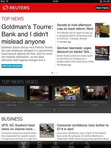
Unstandard navigation bar (Reuters, Editor’s Choice -NY Times-).
Slight use of split view and popover menus, as defined on Apple’s UX Guidelines.

npr
- Same layout on portrait and landscape article view
Editor’s Choice (New York Times)
- Lack of zoom feature, even on image or text visualization (small to read for mature aged people)
- Section access on bottom nav, top nav with no functionality (link to home page)
- Doesn’t stops video playing when changing to another page / when page swiping
- Unexpected elements: when clicking an article image, we discover that there are more images, it’s a slideshow! But we didn’t know there where more images while reading the article…
- Logo doesn’t link to home page
Wall Street Journal
- There’s no clear menu, is not using standard top navigation bar
- Tiny option buttons on a bottom navigation bar
- Hidden option buttons, as text size buttons
- No click function on image to zoom or open slideshow

Reuters
- Into an image slideshow/zoom you can get into an endless loop (foto reuters)

Win! (good practices on the iPad)
Help the user to focus on the content, not on the design.
Bring a natural navigation. Even for someone who has just tried a few times the iPhone, pinching in and out is a natural action. Same for scrolling and swiping. Go on then, use them in your applications!
Not taking literally Apple’s UI guidelines, but interpreting them: try with a natural user interface that doesn’t need to be learned, something that invites to a natural use of the application. That’s, indeed, one of the key points of usability!
Built-in ads that doesn’t bring you out of the app (to Safari, eg.)
Change your grid when resizing font-size. The best number of characters per line is between 55 and 75 (it depends on the Font Family). So it would be nice to decrease number of columns when the font size gets bigger.
Use some UI iPhone standards, but adjusted for the iPad app: as top navigation bars, with back and option buttons.
npr
- Home button
- Clear action buttons: mail, listen,
- Scrolling = read more, swiping more articles
- Zoom in/out on image visualization, zoom out to go back to the article
- Access to sections and top topics with popover menu

Editor’s Choice (New York Times)
- Info bullets on image visualization
- Clear back to article button on image visualization
- Pagination icons to help consistency and user control

Wall Street Journal
- Initial navigation help, clear actions
- Pinch in to zoom in, pinch out to zoom out or to go back
- Double click to go in/ zoom in / adjust to full screen
- Section to section navigation, article to article navigation

Guerrilla iPad user testing
Have you tried to test your apps with an aged man? It’s easy! Here are some conclusions of the guerrilla testing we’ve made with my father 🙂 Two young internet heavy user guys have participated aswell on the testing.
Natural first actions
- scrolling, then swiping
- pinch in to zoom in, or get text bigger
- pinch out to zoom out / get out of the main page
- clicking (even double clicking) to open an application, or go to detail
Other conclusions
- main iPad button as exit for everything, when not a home button visible
- natural zoom in/out on picture visualization
- top nav as main application options, then bottom nav
- gets easily lost when back or home buttons aren’t on a top nav
- expects same buttons / features on different apps
- quickly recognizes envelop icon as email feature, T- / T+ or A- /A+ as text size feature

Remember
It’s made to touch with your fingers (obviously), and not everybody have thin skinny ones. Be cute, make buttons big enough for a male adult index finger or thumb. Don’t make people struggle with thin icons that can be tapped various at once.
Place active areas where they don’t meet with other actions (button, link, ad…)
Scroll vs Swipe. Is scrolling on the iPad more natural than swiping? Against our first ideas, yes, it is. However, if scrolling not working, next natural action is trying to swipe.

Popover menus: use carefully. Remember that usually, we assume that what we are not able to see, does not exist.
Be careful when applying Apple’s apps features: danger with pinch-to-expand feature. «Apple rejects iPad app for pinch to expand» arguing that that’s a feature «associated solely with Apple applications».

Some questions
Same text size on portrait than landscape view? Would this be against Apple’s Guidelines? […] avoid reformatting information and rewrapping text on rotation […]
We’ve seen ust a few social options on the apps. Any strong reason? Socialize is now part of the real world, we are more likely to see those options on our apps.
All this thoughts are just a first approach, so we’ll keep on analyzing and working on our apps.
iPad ‘n Roll 😉


One thought on “iPad, are there any user interface standards? First impressions based on user experience testing”